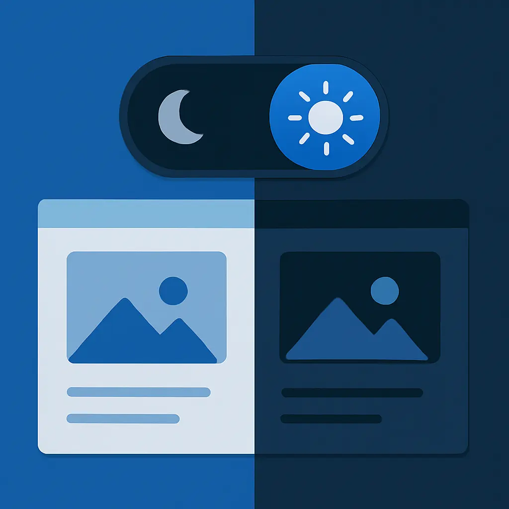
Light, dark, or auto — let your users decide without bloating your site with heavy theming libraries or unnecessary JavaScript.
Shipping dark mode shouldn't feel like summoning Cthulhu. With CSS variables, a sprinkle of media queries, and a few clean lines of CSS, you can give your users the dark mode they crave without the headache.
1️⃣ Why Use CSS Variables?
CSS variables let you instantly switch themes, respect system preferences, and keep your styles clean without extra JavaScript.
2️⃣ The 10 Lines You Actually Need
With a few lines of CSS, you can enable dark mode that respects system preferences and keeps your bundle size tiny.
:root {
        --bg: #ffffff;
        --text: #000000;
      }

      @media (prefers-color-scheme: dark) {
        :root {
          --bg: #000000;
          --text: #ffffff;
        }
      }

      body {
        background: var(--bg);
        color: var(--text);
      }
3️⃣ What If You Want a Toggle?
Some users want manual control over dark mode. You can add a tiny toggle without heavy JS frameworks or theming libraries.
const toggleDarkMode = () => {
        const current = localStorage.getItem('theme');
        if (current === 'dark') {
          localStorage.setItem('theme', 'light');
          document.documentElement.classList.remove('dark');
        } else {
          localStorage.setItem('theme', 'dark');
          document.documentElement.classList.add('dark');
        }
      };
.dark {
--bg: #000000;
--text: #ffffff;
}4️⃣ Expand Your Variables as Needed
Dark mode is more than just background and text colors. Gradually expand your variables for borders, shadows, accents, and more as your design system grows.
5️⃣ Accessibility Matters
Dark mode isn't just an aesthetic flex; it improves readability and reduces eye strain for many users. Always maintain high contrast and test across devices.
6️⃣ Why It's Better Than Heavy JS Approaches
Using CSS variables for dark mode keeps your site lightweight, respects user preferences, and scales effortlessly without additional dependencies.
7️⃣ Test Like a Pro
Test your dark mode across browsers, devices, and both system themes to catch edge cases before your users do.

8️⃣ Advanced Tips for Smooth Dark Mode
Add smooth transitions for a polished experience:
* {
        transition: background 0.3s, color 0.3s;
      }
Use utility classes for quick debugging, and add dark mode toggles to your Storybook or design system for consistent previews.
✨ Ship It
You now have a lightweight, scalable, user-friendly dark mode setup using CSS variables that respects your users and your codebase.
✅ Dark Mode Checklist Before You Launch
- Uses CSS variables for scalable theming
- Respects system preferences via prefers-color-scheme
- Optional user toggle with localStorage
- High contrast and accessible
- Tested across devices and browsers
- Includes smooth transitions
- Uses minimal, maintainable code
💡 Need Help?
If you need support implementing dark mode in your project or want a tailored, scalable design system, contact us. We're here to help you build clean, beautiful, and maintainable digital experiences.
🎉 Share Your Dark Mode
Have you shipped dark mode on your project? Tag us @quantumpixel with your implementation—we love seeing clean code in the wild.
Happy shipping! 🚀