
There is an idea, especially popular among frontend teams and amplified by every design system talk on the internet, that the end goal of interface architecture is perfect reusability. We are told to build for scale. To create the holy grail of flexible, endlessly adaptable, context-free components that can be dropped anywhere, for anyone, in any circumstance — and simply work. The result of this dogma is a generation of developers obsessing over atomic components, hunting for maximum abstraction, and inevitably arriving at the same painful conclusion: the component they built to be used everywhere works nowhere particularly well.
At Quantum Pixel, we have walked into countless projects haunted by this illusion. Codebases bloated by premature abstraction. Button components so hyper-configurable they have ceased to be understandable. Typography systems that attempt to solve every imaginable edge case and end up serving none particularly elegantly. What begins as a noble pursuit of DRY (Don’t Repeat Yourself) principles mutates into an operational nightmare of brittle props, awkward overrides, and accidental design drift — all under the well-meaning banner of reusability.
It is time to be honest about a fundamental truth of front-end development: context matters. Context always matters. And truly context-free UI is an architectural myth that costs more in complexity than it ever returns in utility.
The Problem with Universal Components
The quest for reusability starts from a good place. Nobody enjoys duplicating code. Repetition feels primitive. Reusable components promise order, efficiency, and speed. Early in a project, this strategy can feel like a superpower. The same button component services a landing page, a dashboard, a blog template, and a product card. The codebase feels lean, the design system consistent, the maintenance low.
But the cracks appear quickly.
Buttons on landing pages tend to behave differently from buttons in forms. Call-to-action buttons demand specific hover interactions, unique sizing rules, or micro-animation tweaks that do not make sense in a more utilitarian context. Headers on marketing sites are laid out entirely differently from headers in product dashboards. Cards used for product features become awkward when repurposed for blog posts, and impossible when further adapted for account settings. Every new context introduces subtle demands — in layout, in interactivity, in content flexibility — that the original component was never designed to elegantly accommodate.
Developers patch this by introducing props. Configuration options balloon. Conditional logic metastasizes. The once-pure component becomes a labyrinth of overrides and exceptions. The design system grows harder to predict, the code harder to maintain, and ironically, the output less consistent — because the same component produces wildly different visual results depending on how it is configured.

Why Localised Components Are Usually the Better Answer
The painful truth is that many teams would achieve greater clarity, speed, and maintainability by leaning into context. By allowing different parts of the site to have their own dedicated components, optimised for the job at hand. A call-to-action on a marketing page does not need to be forcibly reconciled with a submit button on a checkout form. A feature card on a product page does not need to share code with a testimonial block on a careers page.
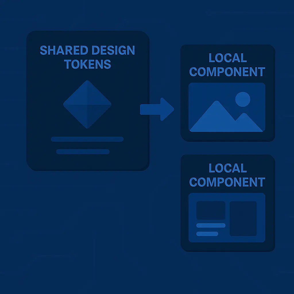
This does not mean abandoning systems. It means designing systems that respect domain boundaries. It means building low-level primitives where it makes sense — things like typographic scales, colour tokens, spacing utilities — but allowing component composition to be specific, purposeful, and aware of its surrounding use case.
By doing so, the developer experience becomes clearer. There are fewer conditionals to trace, fewer props to misuse, fewer style clashes to untangle. The design language remains coherent, but the code architecture avoids collapsing into an unreadable mess of all-in-one components trying to solve incompatible problems.

The Hidden Cost of Over-Abstraction
There is a deeper problem at play when teams fall into the reusable component trap. They stop thinking about interfaces in terms of user experience and start thinking about them purely as code reuse exercises. This leads to poor decisions. Interfaces that should be visually distinct end up unintentionally homogenised. User journeys that require subtle emphasis or differentiation are hamstrung by a design system too rigid to accommodate nuance. Marketing teams grow frustrated because every attempt to create variety on a page requires an engineering compromise. Product managers find small interface changes require expensive rewrites of shared components. Innovation slows, creativity stagnates, and ultimately, the end user suffers.
Reusable components, when misapplied, make the wrong things easy and the right things difficult. They create a false economy of reduced lines of code, paid for by bloated logic, difficult debugging, and frustrated teams forced to hack around the system.
The Practical Way Forward
At Quantum Pixel, our most successful front-end architectures follow a simple but often ignored principle: shared styles, localised components. Tokens, utilities, and base primitives live in a global design system. Contextual components are built where they are needed, optimised for their specific role, unafraid to duplicate small amounts of code when it results in clearer logic and more maintainable outcomes. The goal is not reusability for its own sake, but clarity, predictability, and adaptability.
This approach scales better in the real world because businesses change. Landing pages evolve, product interfaces pivot, new sections of the site demand different interaction patterns. With context-aware components, these changes can be absorbed without breaking everything else. Design remains consistent at the system level, but flexible at the implementation layer.
Reusability Is a Tool, Not a Virtue
The industry obsession with reusable components has blinded too many teams to the reality of interface development. Reusability is not a goal. It is a tactic. It is useful in moderation, dangerous in excess, and catastrophic when pursued without respect for context.
Great interfaces are not born from maximum abstraction. They are born from thoughtful architecture, purposeful duplication, and a healthy respect for the differences between marketing sites, product dashboards, and content hubs. When developers embrace this balance, they write clearer code, ship faster features, and build systems that serve both the user and the business — without collapsing under the weight of their own ambition.
If your team is tangled in the myth of universal components and wrestling with a bloated design system that serves nobody particularly well, there is a better way. It starts by embracing the reality that context matters, duplication is sometimes a feature, and architecture should serve outcomes, not dogma.