
In the digital age, it’s tempting to believe that more is better. More features. More animations. More CTAs. More custom layouts. More pages, fonts, colours, breakpoints, edge cases — because, well, why not? The web is infinite, right?
Except it’s not.
Every design decision — every visual variant, every layout permutation, every whimsical flourish — carries cost. Not just in development hours or load time, but in user attention, cognitive overhead, and ultimately, conversion rate.
And this is where one of the most misunderstood — and underutilised — tools in modern web design comes into play: constraint.
Constraint is not a limitation. Constraint is a design principle. It is the art and science of removing choice to guide behaviour. And when applied with care, it’s one of the most powerful levers you have for building websites that actually work.
What Happens When You Don’t Constrain
We’ve seen it a hundred times.
A website is built with the best of intentions — clean design, strong branding, flexible CMS. But somewhere along the way, things loosen. A second button style creeps in. A new layout variant gets hard-coded for one team’s campaign. A third heading size emerges “just for this page.” The design system becomes optional. Patterns get duplicated. Pages get built by different hands using slightly different rules.
Before long, the system isn’t a system. It’s a soup.
And with it goes the user’s confidence. Because humans notice inconsistencies, even if subconsciously. They don’t file tickets about visual drift — they simply stop trusting what they see. And in high-friction environments (like checkout pages or pricing tables), that eroded trust becomes abandoned carts and missed conversions.
This is not hypothetical. This is physics. And entropy always wins — unless constrained.
Why Constraints Work
Design constraints are not arbitrary rules imposed by pedantic designers. They are psychological affordances. They provide predictability. They reduce cognitive load. They create rhythm and hierarchy. And they make it easier for the user to do what you want them to do.
Consider:
A button that always looks the same, behaves the same, and is placed in consistent proximity to key content creates muscle memory. Users learn to trust it. They click faster. They hesitate less.
A grid system that enforces margin and rhythm across every device means that your layout never “feels” wrong, even if the user doesn’t know why. It just feels professional. Finished. Considered.
A limited colour palette reduces visual noise. It helps direct the eye. It reinforces brand. It subtly says: “We know what we’re doing.”
In short: constraints reduce decision fatigue — not just for the user, but for the people building the site. And when implemented intentionally, they accelerate everything: production, navigation, comprehension, conversion.

The Illusion of Customisation
“But won’t constraints limit our creativity?”
This is a common objection. And it stems from a fundamental misunderstanding of what creativity actually is. Creativity does not flourish in a vacuum. It flourishes within boundaries. Jazz is not an absence of structure — it’s the manipulation of structure. Good design systems don’t restrict you from being creative. They force you to be strategic with that creativity.
If anything, unlimited freedom is the fastest route to incoherence. You don’t end up with innovation — you end up with inconsistency. And inconsistency kills trust.
A marketing site that treats every section as a new design challenge doesn’t feel dynamic. It feels chaotic. And the result is death by a thousand micro-decisions, both for the team building it and the users navigating it.
Constraints in Action
At Quantum Pixel, we don’t just tolerate constraints — we engineer them deliberately.
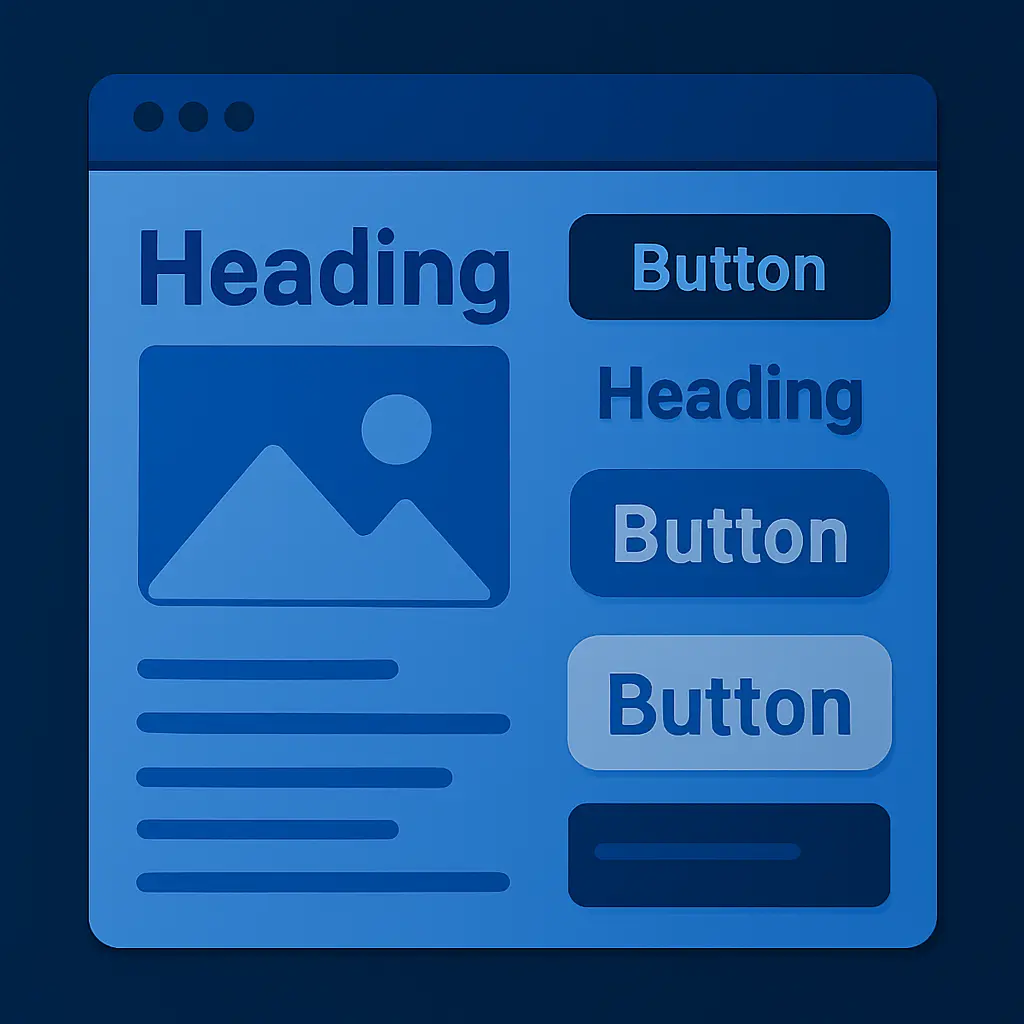
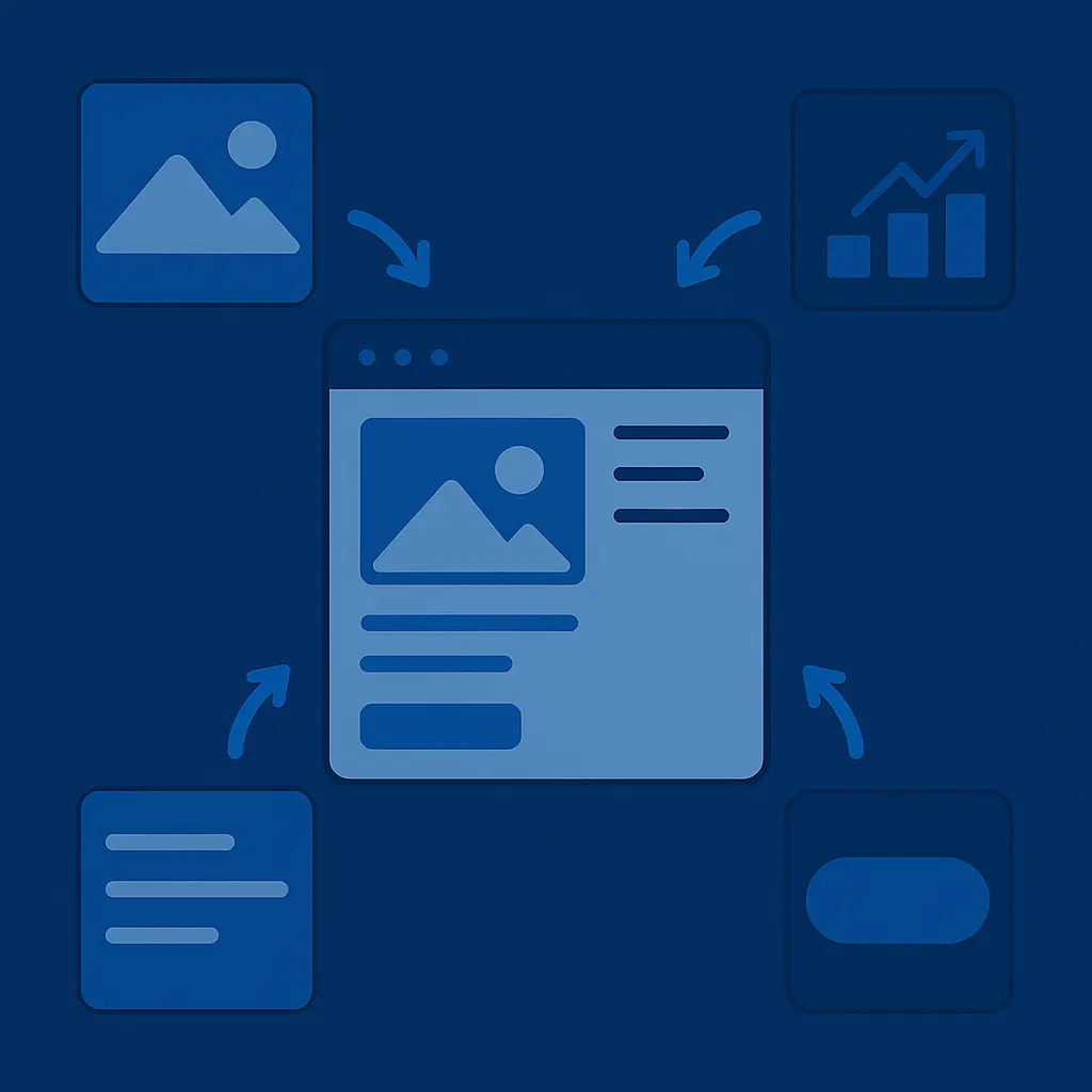
We use modular design systems with tight guardrails. Every component is scoped for purpose. Every layout has rules. Typography is locked to a scale. Colour variants are tokenised. Buttons are atomic. Spacing is controlled. And every new request goes through a gate: “Can this be achieved with the system?”
Sometimes the answer is yes. Sometimes it’s no — and we make a surgical addition. But what we never do is allow one-off exceptions to become silent defaults. That’s how bloat begins.
This isn’t about dogma. It’s about discipline. Because discipline makes scale possible. And scale — in performance, consistency, marketing agility, and UX clarity — is what separates pretty websites from profitable ones.
Final Thought: Freedom Through Form
The most effective websites in the world are not endlessly flexible. They are rigorously constrained.
They do less — better. They give users fewer decisions, not more. They don’t chase novelty for its own sake. They create systems, enforce structure, and limit variables. Not because they can’t do more, but because doing less, intentionally and beautifully, works.
So the next time you feel the urge to add another layout, another heading style, another shade of blue — pause.
Ask yourself not what’s possible, but what’s necessary.
And then build accordingly.