
“Somewhere between the logo discussion and the first budget meeting, the phrase slips out — quietly, confidently, as if it solves everything in one fell swoop:
We just need a simple site. A one-pager, really.
It's spoken with admirable optimism. The founder wants to move fast. The marketing team wants to keep things lean. And the developer, if they haven’t already silently groaned, is now weighing whether to explain or just nod along.
Because the one-pager — clean, minimal, conceptually elegant — is one of the most misunderstood formats in modern web design. It offers the illusion of simplicity but rarely delivers on it in practice. In fact, for the vast majority of businesses with ambitions beyond just existing, the single-page site becomes not just a constraint, but an active liability.
This is not to say one-pagers are inherently bad. But they are almost always oversold. What follows is a calm, nerdy, and unflinching breakdown of where the one-page model fails, when it might actually work, and how to think more strategically when you're aiming for something ‘simple.‘
Why the One-Pager Sounds Like a Good Idea
Let’s start with why it’s so tempting.
The idea of a one-page website has an elegant ring to it. It conjures an image of streamlined efficiency — less to build, less to maintain, less to think about. For early-stage businesses or teams juggling multiple priorities, it feels pragmatic. You’re not aiming to become the next Amazon or Apple. You just need something that looks professional and tells people who you are.
There’s also an aesthetic element. One-pagers tend to appear clean. There are no dropdown menus. The scroll is uninterrupted. The design feels modern by default — until, of course, you try to use it in the real world.
Where One-Pagers Begin to Break
The moment your website is expected to do anything more than act as a digital business card, the cracks begin to show.
Let’s start with the most obvious: search engines. Google doesn’t rank websites. It ranks pages. A one-pager means you have precisely one opportunity to structure your metadata, your headings, your schema, and your keyword targeting. There’s no room for segmentation. No dedicated service pages. No long-tail strategy. It’s a content straightjacket, and it actively limits your organic reach.
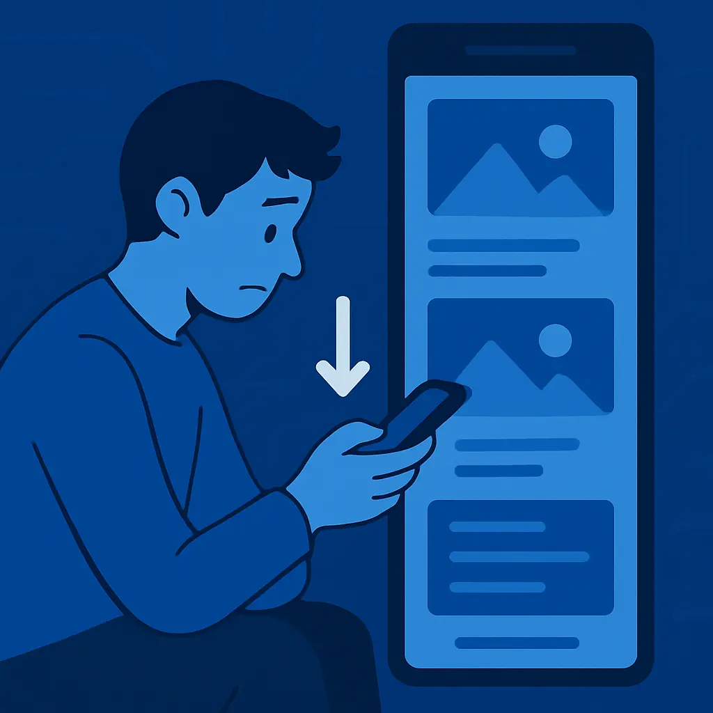
Then there’s the user experience. Visitors rarely read in linear order. They scan, skip, and dive into the section most relevant to their intent. On a one-page site, this means endless scrolling or awkward anchor links that simulate navigation without the UX benefits of actual pages. The further down the page your content lives, the less likely it is to be seen. Important information ends up buried not by accident, but by architectural design.
And then there's marketing. One-pagers give your marketing team nothing to work with. Campaigns need landing pages. Ads need clean URLs. Content needs space to breathe. With only one page to link to, segment, or iterate on, the marketing velocity of the site drops to near-zero. You can’t test different narratives. You can’t route traffic meaningfully. Every tweak becomes a negotiation, not a tool.
The net result is a paradox: what started as a project to reduce complexity ends up increasing operational friction. You save time on the build, only to lose far more on every future use case.
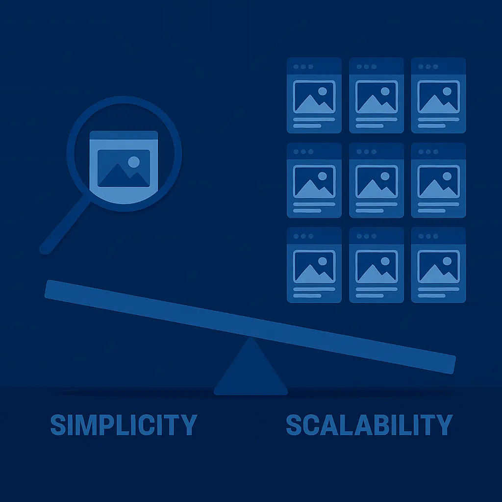
The Scalability Dilemma
Of all the limitations, this one might be the most insidious.
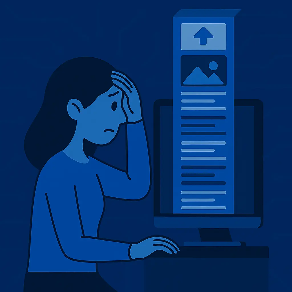
Most one-pagers are built for the present — where the business is now, not where it’s going. But growth introduces new requirements. Maybe you want to add a product line. Or create a team page. Or introduce a blog, case studies, a careers section, or a customer portal. Suddenly, the tidy linear scroll becomes an unmanageable sprawl.
New sections are bolted on. Layouts start to feel cramped. The visual rhythm stutters. What was once minimalist now feels like a glorified Word document — endlessly long, difficult to skim, and impossible to organise meaningfully.
And inevitably, the rebuild comes. Because at some point, the structure no longer supports the story. And all the effort and budget you tried to avoid in round one returns — this time with added technical debt.
When One-Pagers Actually Make Sense
To be fair, there are edge cases where the one-page model can work well. If you're running a short-term campaign, launching a teaser site for a product not yet in-market, or simply validating an idea with a placeholder form, a single page might serve its purpose.
The key, however, is to treat it as provisional, not permanent. It's a scaffold. A prototype. A placeholder until the business grows into its real digital presence.
Problems arise when the one-pager is mistaken for the final product — when it's meant to serve not just as a temporary entry point but as the enduring face of your business online.
What Simplicity Actually Looks Like
True simplicity isn’t about page count. It’s about clarity of purpose.
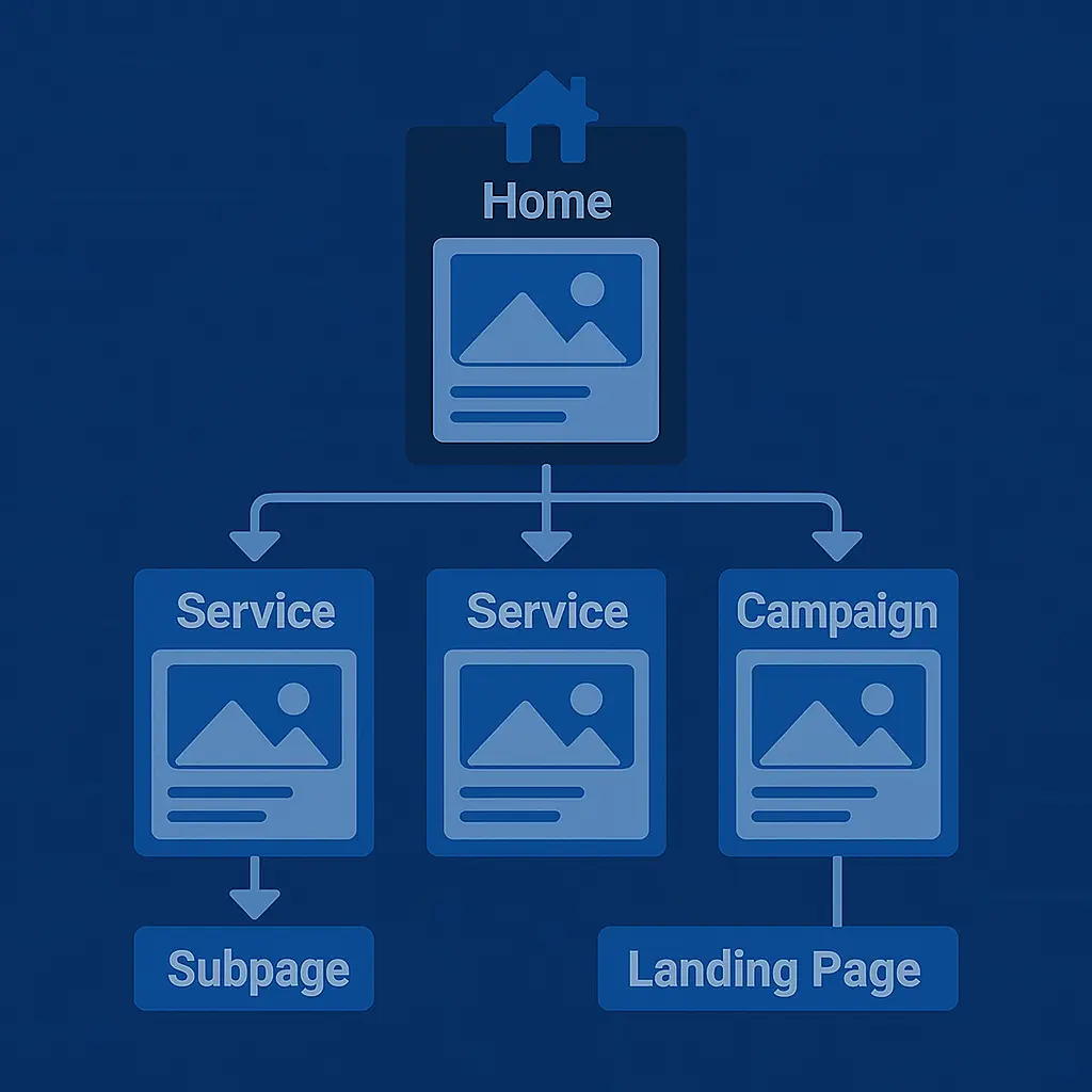
A well-structured marketing site can be simple without being simplistic. It gives each message its own space. It allows users to self-navigate according to their needs. It supports SEO without keyword cannibalisation. It empowers marketing teams to iterate without developer bottlenecks. And it scales without forcing a complete rebuild every 12 months.
The irony is that building that kind of simplicity takes more work up front — in planning, in structure, in architecture. But the reward is a site that performs, evolves, and endures.
At Quantum Pixel, this is the model we champion: a modular, scalable foundation that can start small and grow naturally. We help our clients avoid building something they’ll outgrow in six months. Because every hour spent retrofitting a one-pager into a real system is an hour that could have been saved by doing it properly the first time.
Final Thought: Simplicity Isn’t About Size. It’s About Systems.
One-pagers are the sugar rush of web design: quick to consume, immediately gratifying, but ultimately unsatisfying when the real work begins.
If your business has a story to tell, a product to market, or a future to scale into, you need more than a scrollable placeholder. You need a digital system — one that’s thoughtfully structured, user-aware, and built to last beyond this quarter’s pitch deck.
So no, you don’t need fifty pages. But you probably need more than one.
And if you’re still unsure? Let’s talk. We’ll show you how to keep things lean without cutting corners — and how to build something that stays simple even as your business stops being small.